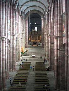
This summer I visited the city of Speyer, primarily because I wanted to see its cathedral. Speyer cathedral is the largest Romanesque church in Germany, one of three great cathedrals of this type (the other two are at Worms and Mainz). It was originally built in 1030, and its long history has included expansion, destruction, and rebuilding. A UNESCO World Heritage site, Speyer Cathedral is a majestic church, home to a vibrant diocesan community which my husband and I were pleased to worship with on a Sunday while we were there. Here is a picture of the nave of the church.
I was particularly interested to see what sort of baptismal font this church would have. The baptismal chapel is located in a prominent spot in the south transept. The chunky modern pedestal font [see picture below] has a certain gravitas about it, and is certainly immovable—set one step down from the chapel floor. The paschal candle too was hefty. There was a strong sense that these two liturgical items: font and candle, define the space and give it a distinctive character.
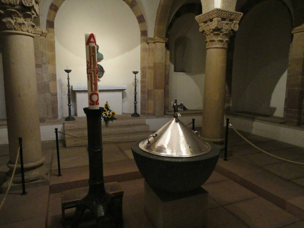
I am not a fan of pedestal fonts, because they can’t be used for the immersion of adults. This font seemed large enough to immerse an infant however, so it was not as bad as what liturgists call, derisively, a “birdbath” font. Still, it seems a missed opportunity especially for a church of such size and grandeur, and one which has taken care to create a space for baptism.
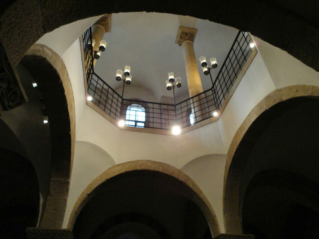
There was room enough for a modest-sized assembly to gather around the font, standing. For a celebration of infant baptism, involving several families and a portion of the parish, it seemed adequate. Everyone could be close to the action, and the stone would provide a live acoustic. The room is brightly lit with natural light from an atrium above as well as artificial lighting.
After checking this out, I thought we were finished with fonts. But no. In the crypt chapel, under the apse, there was another font. When I discovered this one, I knew we were in the presence of something far more compelling and worthy than what we had just seen upstairs. It was the old font, the ancient font, built in the days when immersion of adults was the norm. It’s the oldest font north of the Alps.
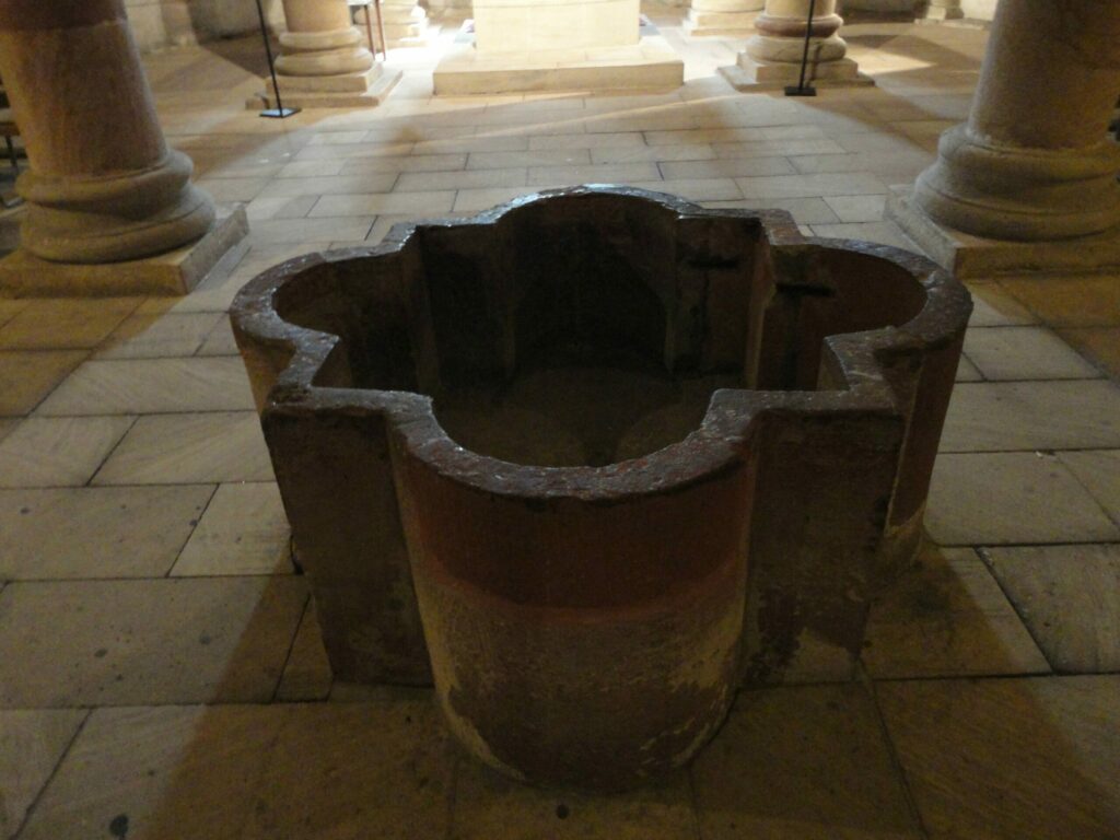
In a sense the font is cross-shaped, yet that is too simple a description. It is deep as the vault of a tomb, yet the four rounded lobes suggest a circular or womb-like shape, or perhaps the perfect geometry of a flower. It’s not eight-sided, but count the protuberances: four lobes plus four points equals eight. It is weighty, yet graceful, a masterpiece of design. To me, it evoked the paschal mystery.
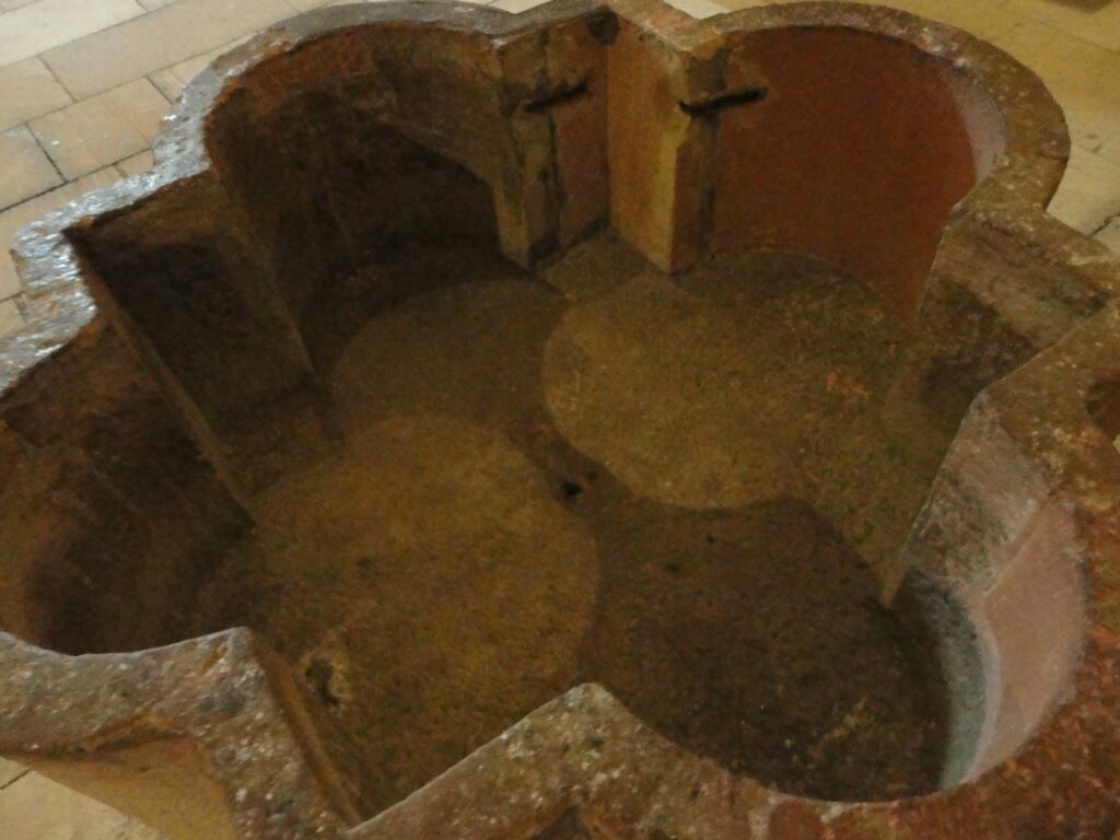
I imagined all the people who must have been baptized in this font. I thought about how it survived through so many centuries—almost a millennium! It even survived the burning down of the building. The stone is patched and repaired, smooth to the touch. I touched it as one touches the relics of the saints.
I inquired of a friend who knows the diocese: Is this the font used at the Easter Vigil, for the baptism of adults? Sadly, the answer came back: No. They take out a portable font and put it in the sanctuary. “Some little thing” my friend reports. Clearly, he is as disappointed as I am.
Still, the old font stands there. “Enough water to die in,” as my mentor, Aidan Kavanagh, OSB, would have said. It remains a witness, proclaiming resurrection as it has for almost a thousand years. What a pity that it isn’t used.
We need to rediscover the meaning of baptism. Dying and rising, not only a symbolic washing, is what the reformed rites of initiation call us to. In far too many churches, we still try to symbolize this fullness with signs and symbols that are just too small.


Thanks Rita! Wow, what a contrast in fonts. I got goosebumps looking at the second one. I’m trying to imagine the long, dark, (cold?), Easter Vigils when it might have first been used. The beauty and the mass of the font indicate a powerful commitment to the rituals of initiation. I wonder what the rest of the liturgy must have been like.
You said the cathedral was constructed in 1030. I assume that is when it was finished. Do you know how long it took to build? And was the crypt font built at that time, or was the cathedral built on top of a more ancient church?
Nick, my information about the font itself is limited to a very small write-up on the self-guided tour, which did not date it precisely but only said it was the oldest font north of the Alps. My book on Romanesque architecture says the crypt was the first part of the whole church to be built, between 1027 and 1030, and I am guessing the font was built at that time, but I can’t be sure. The church above ground was built in 2 phases, between about 1030 and 1106, and dedicated in 1061. Wouldn’t it be interesting if the font were the first thing built, and the rest of the church around it!
To my knowledge there was no previous church on that site, but there was a town there, so presumably they met someplace to worship. That building, wherever it may have been, does not survive. The cathedral is the oldest church in the city, and it was not initially a cathedral, but belonged to the Bamberg diocese.
Yes, cold would be a factor. The absence of separate baptistries in that part of the world attests to the need to stay indoors, out of the cold, in early spring–at least if you’re still wet from baptism!
Rita, your descriptions and pictures of the fonts are breathtaking. Made me feel like I was looking at them myself. The ancient font is magnificent. Do you know of any other fonts with that shape? Was that a common shape of that era? I wonder what the four points and four lobes mean?
Thanks, Rita! I have seen pictures of fountains of that shape, and simpler cruciform fonts that have lobes, but not one that is identical to this. Regarding meaning, on the internet, I came across a site that said 4 lobed sides suggest the four rivers of paradise, but there was no source so I am not sure that’s a reliable interpretation. Frankly, I’ve been combing my resources at home for more information, and have not yet found answers to all my questions. The font is pictured in Regina Kuehn’s book, “A Place for Baptism,” but she does not say a whole lot about it, aside from contrasting it with “pretty fonts” that are built in some places today. She recognized the design as powerful, rather than “pretty,” and I think I would agree.
Thank you Rita…about 12 years ago during our last church renovation, our parish had a baptismal pool added. The pool sits at the base of the baptismal font and is covered by a beautiful floor between Pentecost and Holy Saturday. I love when the floor is removed and the pool is visible from Holy Saturday through Pentecost. While I have seen some beautiful baptismal fonts, I must say nothing says “dying and rising” as well as a immersion pool. Thank you for sharing your photos and experience. Donna Tomasini
Thanks for posting this pictures. The shape of the more ancient of the two fonts is a “barbed quatrefoil,” a variation of the “quatrefoil” symbol that can be found in at least one other famous baptistry constructed around this same period (i.e. the doors of the Baptistry of St. John in Florence, c. 1330).
The plain quatrefoil shape is similar to a cross with rounded lobes and is quite common in extant ancient fonts (c. 4th-10th centuries). The difference with the font in Speyer, though, is the inclusion of the “barbs,” or points, in addition to the rounded lobes. It might have been used since the barbed quatrefoil is a somewhat common shape used in architectural ornaments and/or because the addition of the barbs gives the font 8 “sides,” as the number 8 is important in baptismal symbolism.
Hi Brad,
Thanks for your comment. Although the shape of the font does somewhat resemble the decorative and heraldic shape known as the barbed quatrefoil, this answer does not fit all the criteria necessary for a positive identification. First, the corners are not barbs (the classic examples are more pointed than right angles). Second, they do appear on the baptistry door in Florence, but as a decorative motif not as a font design. Wikipedia has a drawing identified as a barbed quatrefoil shape that looks like our font, but it also says the earliest example is in Notre Dame in Paris. If the font at Speyer can be dated to the first construction, it would be more than 2 centuries earlier. Much depends on the age of the font, which I would like to ascertain.
It strikes me that parishes motivated to revive the older baptismal pattern could do worse than to copy this older font. It would be visually out of place in neither a neo-gothic or -romanesque building or a spare modern one! (My only reservation: did they use portable stairs or ladder to enter it? And candidates who are partially disabled might need other arrangements?)
Just came across this post – the shape of the font is indeed a classic barbed quatrefoil, an ancient geometric motif used throughout the western world. Although there are numerous examples found in Moorish architecture as well, it’s overwhelmingly seen in European mid-late gothic contexts. Although defined as “a quatrefoil superscribing a square”, the ‘barbs’ and ‘lobes’ are depicted a variety of ways. There are hundreds of thousands of surviving examples of this geometric shape, in various forms, and many are older by far than the Notre Dame transcepts (Gasp! Wikipedia is wrong!). Given its ancient and widespread use, it’s unlikely to be purely a Christianity symbol however – more likely it simply presented a harmonious, balanced shape, which appealed to the mid-Gothic mind. Since it also required no small amount of precision to create, it demonstrated a certain level of commitment to wherever it was being depicted. This font is stunning, by the way, and I’m thinking about creating a similar one.
Thank you for your comment, Michael! And good luck with designing something similar to this font. Maybe when it is finished you could share a picture of the result with TeamRCIA, either by linking to a picture in the comment box here or by sending a pic to Nick Wagner or Diana Macalintal and referencing this post.
It sounds as if you are a student of the history of architecture. Can you direct me to a source for the claim that there are “hundreds of thousands” of barbed quatrofoils prior to the high middle ages?